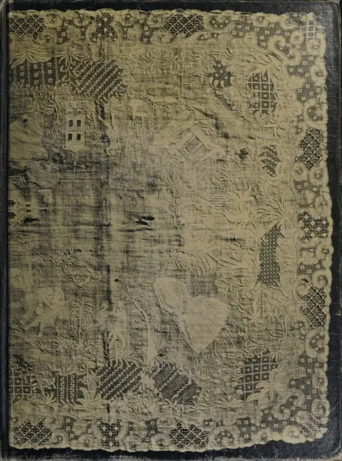
American lace & lace-makers
Emily Noyes Vanderpoel
THE CLASSIC COLLECTION · 1901
Color Problems by Emily Noyes Vanderpoel is a practical manual on color theory and design written in the early 20th century. It translates scientific and artistic insights into usable guidance for decorators, designers, artisans, and general readers. Expect concise explanations paired with extensive color plates, practical rules for combining hues, and analyses drawn from history and nature.
The opening of the manual states its purpose: to bridge rigorous color science and studio practice with brief text and many plates so lay readers can apply what they learn. An introduction praises its usefulness for arranging contrasts, quantities, and subdued tones, and for its clear “historic color” diagrams. The first chapter addresses color-blindness—its forms, detection with simple wool tests, causes, prevalence, and practical aids such as colored lenses. It then outlines how the eye and light produce color, surveying major theories (Young–Helmholtz and Hering), before defining hue, purity, and luminosity, warm/cool behavior, and the making of tints, shades, and broken tones, including how pigments and lighting (daylight, gas, electric, and colored light) shift appearances. Next, it explains simultaneous, successive, and mixed contrast, how to find complementary pairs (via Maxwell disks), and offers practical rules for balancing quality and quantity of color—illustrated by examples like a scarlet accent against blue-green—before beginning a framework of wider harmonies based on Chevreul’s schemes of analogy and contrast.
Introduction adapted from the source catalogue; source summaries may be automatically generated.
Free to read · English · 31,193 words · No account needed
MAKE TIME FOR A GOOD BOOK
On by default. Untick to stop anonymous reading totals. Each page counts after 10 seconds in view. How this works.
Anonymous counting is on unless you have switched it off.
SECONDARY COLORS: orange, green, and violet; so called because it has been thought they were made from combinations of the primary colors.
SELF-TONES: see Tone.
SHADE: a tone of a color darkened by the addition of black pigments to paints, inks, dyes, and stains, or by the action of diminished light on immaterial colors.
SHADOW: about the same as shade, as generally used, but for the sake of clearness it is best to designate by shadow those parts of an object which do not receive any direct rays of light, while those surfaces which receive but little direct light, and are thus intermediate in value between the light and the shadow, are called shade surfaces. Then the term cast-shadow denotes the shadow projected by one body on another body or surface.
SOLAR SPECTRUM: see Spectrum.
SPECTRAL COLORS: see Normal Colors.
SPECTRUM: the result of the decomposition of a ray of sunlight into all the colors which form it; the streak of colors formed by a ray of light that has passed through a prism or over a Diffraction Grating.
STANDARD COLORS: those of the spectrum.
TERTIARY COLORS: citrine, olive, and russet, so called because it has been thought that they were made from combinations of the secondary colors.
TINT: a tone of a color produced by the addition of white to oil, water to water, and white light to immaterial colors.
TONE: the given state of a color as it may be pure, luminous, broken, compound, a tint, or a shade.
Self-tones: tones of the same color.
TRANSPARENT COLORS: those in which the color tints the paper or canvas, which shows through the color, thus helping to produce the effect.
VALUES: the relative amount of light contained in the different colors of a picture, design, or composition; the lightest or most luminous being called the highest in value.
WARM COLORS: those of the longer wave lengths, as yellow, orange,
and red.
WATER COLORS: pigments prepared to be used with water.
WAVE LENGTHS OF COLORS: objects having no color in themselves possess the power of reflecting waves of light; waves of light of varying lengths give us the effect of color. Either the amount of motion of the ether, or height of the wave, produces the intensity or brightness of the light, and the length of the wave produces the color; red has a wave length of about 7000/250,000,000 of an inch, orange 5979/250,000,000, yellow 5802/250,000,000, green 5272/250,000,000, blue 4732/250,000,000, and violet 4059/250,000,000.
Your reading position is saved on this browser. Take it to another device with a library code. Reading pages adapt to text, rather than matching a printed edition.
Emily Noyes Vanderpoel
BEHIND THE BOOK
This eBook is for the use of anyone anywhere in the United States and most other parts of the world at no cost and with almost no restrictions whatsoever. You may copy it, give it away or re-use it under the terms of the Project Gutenberg License included with this eBook or online at www.gutenberg.org. If you are not located in the United States, you will have to check the laws of the country where you are located before using this eBook. Read the source licence.
The original source file, including credits and licence, is retained by this library. Request an original-format copy at no charge. Please include the book title and Project Gutenberg identifier #77736.
KEEP YOUR CURIOSITY GOING
Charles G. (Charles Griffith) Ross
Hannah Webster Foster
Emily Lawless
Edwin Hamlin Carr
Charles De Lano Hine
Andrew Ure