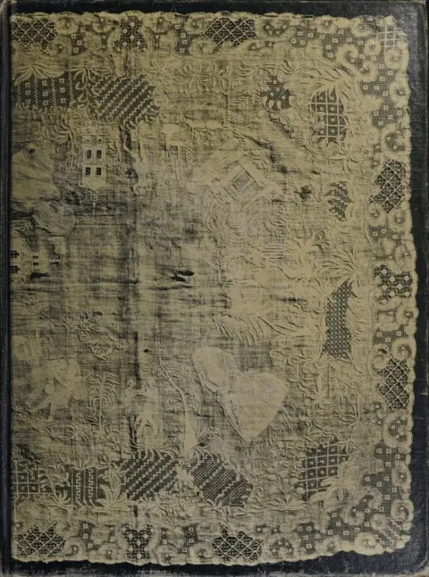
American lace & lace-makers
Emily Noyes Vanderpoel
THE CLASSIC COLLECTION · 1901
Color Problems by Emily Noyes Vanderpoel is a practical manual on color theory and design written in the early 20th century. It translates scientific and artistic insights into usable guidance for decorators, designers, artisans, and general readers. Expect concise explanations paired with extensive color plates, practical rules for combining hues, and analyses drawn from history and nature.
The opening of the manual states its purpose: to bridge rigorous color science and studio practice with brief text and many plates so lay readers can apply what they learn. An introduction praises its usefulness for arranging contrasts, quantities, and subdued tones, and for its clear “historic color” diagrams. The first chapter addresses color-blindness—its forms, detection with simple wool tests, causes, prevalence, and practical aids such as colored lenses. It then outlines how the eye and light produce color, surveying major theories (Young–Helmholtz and Hering), before defining hue, purity, and luminosity, warm/cool behavior, and the making of tints, shades, and broken tones, including how pigments and lighting (daylight, gas, electric, and colored light) shift appearances. Next, it explains simultaneous, successive, and mixed contrast, how to find complementary pairs (via Maxwell disks), and offers practical rules for balancing quality and quantity of color—illustrated by examples like a scarlet accent against blue-green—before beginning a framework of wider harmonies based on Chevreul’s schemes of analogy and contrast.
Introduction adapted from the source catalogue; source summaries may be automatically generated.
Free to read · English · 31,193 words · No account needed
MAKE TIME FOR A GOOD BOOK
On by default. Untick to stop anonymous reading totals. Each page counts after 10 seconds in view. How this works.
Anonymous counting is on unless you have switched it off.
Given a certain amount of any color, say normal or spectral red, and wishing to make it look as bright as it can, what color shall we put with it, and how much of that color, to attain our purpose? To answer that question correctly, having in the last chapter studied the harmony possible in what have been called self-tones, or one-color combinations, we will take up contrasts, of which we have several kinds, as follows:
Simultaneous contrasts of tone, neutral.
Simultaneous contrasts of color on neutral grounds.
Successive contrasts.
Mixed contrasts.
Contrasts of complements.
Contrasts of other hues or lesser contrasts.
Contrasts of brightness.
Contrasts of purity.
Contrasts of cold and warm colors.
The first point to understand clearly is the law of simultaneous contrast of tone as studied and written about by Chevreul in his elaborate work on color. Church explains this law: “Contrast caused by difference in brightness is commonly called contrast of tone. This kind of contrast may occur alone or it may be associated with contrast of hue and contrast of purity. It will be well to consider first the simplest cases, in which contrast of tone is not accompanied by other contrasts. It is impossible, however, to reduce experiments on tone-contrast to their simplest expressions, because a third element always comes in, namely, the background on which the pair of tones is placed for examination. Whether this background be black, white, gray, or colored, it must necessarily differ in some one direction from one or both the trial pieces, and will therefore itself produce a contrast. To minimize the complication thus introduced we may try an experiment for producing the phenomena of tone-contrast in three ways, using three backgrounds with identical trial pieces on each. We first take two strips of light gray paper, A and A′, in Plate XV, and place them a few inches apart on a large sheet of (white) paper in a good light. We then prepare two similar strips of a considerably darker shade of gray, B and B′, and place them, as shown in the diagram, B′ alongside of A′ and the other the same distance from B′ as A is from A′. On close observation it will be seen that A′ close to B′ appears lighter than A, which lies at some distance, while B appears correspondingly darker than B′. The effect of contrast in enhancing differences of tone may be studied thus: Make such openings, five in number, in a piece of card, as will serve to divide each of the strips A and B into three portions. When viewed through this card, held between the trial pieces and the eye, it will be found that the two adjoining parts of the strip are most contrasted in tone, and the others less so in proportion to their distance from the line of contact. The experiment should now be repeated with a background of black velvet, and again with a background of gray paper lighter in tone than either of the strips. The effect of contrast of tone is still better seen in a series of toned strips placed next each other. In such a case the effect on all the strips save the end ones is that of double contrast. For the second strip or second tone has one side of it made apparently darker by reason of the contiguity of the lighter tone of strip, while the other side seems lighter, owing to the contiguity of the darker tone of strip 3. The general result of these double contrasts is that the whole series or scale of tones gives the appearance of a number of hollows, although, in fact, the apparent hollows are perfectly flat areas of uniform shade. The effect of this experiment is approximately represented in Plate XV, where the real flatness of each tone of the six may be verified by covering up all the others by a card. Tones of any one color instead of gray may be thus employed to illustrate this kind of simultaneous contrast, but its characteristic effect is not seen unless the contrasting tones differ considerably in intensity, increase by regular gradations, and are near each other, or in absolute contact. However, if tones of a color, whether in tints or shades, be used, there is generally a complication introduced, owing to the difficulty of getting a series of such tones which shall be the same in hue.
Your reading position is saved on this browser. Take it to another device with a library code. Reading pages adapt to text, rather than matching a printed edition.
Emily Noyes Vanderpoel
BEHIND THE BOOK
This eBook is for the use of anyone anywhere in the United States and most other parts of the world at no cost and with almost no restrictions whatsoever. You may copy it, give it away or re-use it under the terms of the Project Gutenberg License included with this eBook or online at www.gutenberg.org. If you are not located in the United States, you will have to check the laws of the country where you are located before using this eBook. Read the source licence.
The original source file, including credits and licence, is retained by this library. Request an original-format copy at no charge. Please include the book title and Project Gutenberg identifier #77736.
KEEP YOUR CURIOSITY GOING
Charles G. (Charles Griffith) Ross
Hannah Webster Foster
Emily Lawless
Edwin Hamlin Carr
Charles De Lano Hine
Andrew Ure